 Runes in Diablo II: Resurrected were never just items to socket into gear. They were visual statements. Each one looked deliberate, heavy, and old. Long before players learned what a rune could do, they felt that it mattered. That same sense of weight and meaning is part of why D2r items for sale still draw attention today, not just for power, but for the iconography behind them. That feeling, rooted in design rather than mechanics, has had a lasting impact on how modern fantasy presents magic through symbols.
Designed to Feel Ancient, Not Decorative
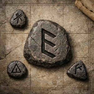
The strength of D2R’s rune symbols lies in their restraint. The shapes are angular and spare. No flourishes. No ornamental borders. They do not try to impress at first glance. Instead, they suggest age and purpose, like marks carved into stone by someone who knew exactly why they were doing it.
This approach stands in contrast to much fantasy art, which tends toward excess. D2R’s runes show that symbols gain authority when they look functional rather than beautiful. Many modern fantasy designers now follow the same rule. If a symbol represents power, it should look like it was made to work, not to decorate a page or screen.
Readability as a Core Artistic Choice
Another reason these runes endure is clarity. Each symbol is legible even at small sizes. The lines are bold enough to survive compression, scaling, and low resolution. That mattered in the original Diablo II, and it still matters today across mobile screens, UI icons, and printed materials.
Modern fantasy games and tabletop systems have absorbed this lesson. Glyphs are now designed with silhouette first, detail second. If the shape does not read instantly, it fails. D2R’s rune set helped prove that clean, confident forms age better than intricate ones.
Symbol Sets That Reward Learning
A single rune in D2R is incomplete by design. Its meaning expands when combined with others. This idea shaped more than gameplay. It shaped how designers think about visual language. Runes became something you learned to read over time, not something explained up front.
Today, this philosophy appears in spell systems, puzzle mechanics, and worldbuilding symbols across fantasy media. Designers create visual systems that encourage pattern recognition. The art invites curiosity. D2R showed that mystery is not confusion if the symbols are consistent.
The Power of Negative Space
D2R’s runes are framed carefully within their inventory tiles. They do not crowd the edges. They sit with confidence, surrounded by space. That breathing room gives the symbol weight. It tells the viewer that this mark does not need to fight for attention.
Modern fantasy logos, faction emblems, and magic icons often follow the same principle. Negative space is no longer space. It is part of the design. It reinforces authority and control. In this way, D2R’s runes influenced not just what symbols look like, but how they occupy space.
Visual Progression Without Excess
Higher-tier runes in Diablo II felt more important even before players understood drop rates. Their designs were sharper and more severe. Not bigger. Not brighter. Just more refined. This subtle escalation taught designers a vital lesson: power does not have to be loud.
Many modern fantasy systems still use this logic. Advanced magic looks older, more abstract, and less readable at a glance. The design suggests knowledge accumulated over time. D2R helped normalize this visual language, where restraint signals mastery.
Materiality in a Digital World
D2R’s rune art leans heavily on texture. Stone, wear, and roughness are implied even in small icons. This gives the symbols a physical presence. They feel carved, not drawn. That material quality has become a staple in modern fantasy art direction.
You see it now in etched metal spell icons, worn parchment maps, and stone-like UI elements. Magic feels embedded in the world rather than layered on top of it. D2R’s runes were early proof that digital art benefits from pretending it exists in the physical world.
Leaving Space for Interpretation
One of the most influential choices was what Diablo did not explain. The game offered little explicit lore for each rune. Their origins were vague. Their meanings were learned through use. This silence gave the symbols room to resonate.
Modern fantasy designers understand this restraint. Overexplaining weakens symbols. A strong rune should suggest history without narrating it. D2R trusted form to do the work, and that trust paid off.
A Lasting Visual Language
Diablo II: Resurrected did not redesign its runes because it did not need to. Their visual language still works. It still feels serious. It still communicates power through shape alone.
That is why their influence persists. The best fantasy symbols are not loud or ornate. They are quiet, confident, and patient. Like D2R’s runes, they wait for the viewer to learn how to read them.